|
# 1 -
Posted on 2/1/2019 21:57:51
Hey everyone, after months of silence regarding new site updates, I've finally reached the point where I'm ready to reveal what I've been working on! In early October 2018, I started implementing a new UI theme / template that turned out to be a huge undertaking. There were a number of factors at play here, but these are some of the bigger reasons why I decided to do this:
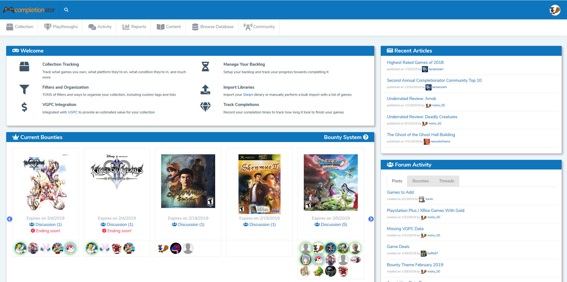
From a UI perspective, the goal for this upgrade was not necessarily to make drastic changes to the overall site layout. In fact, I tried to do my best to keep things as similar as possible, aside from certain areas that just needed to be reworked. So in general, things should be in the same spot and look very similar to how they were before...just with a new coat of paint on them. One of the first things you'll likely notice is the menu. Since some of the pages here can be rather wide, I wanted to ensure we had a template that used a top menu instead of one on the left: One problem we kept running into with the left menu is we just had so many items! I think a top menu will work much better as we continue to grow in functionality. I did my best to try and categorize menu items, but as everyone starts using the site, there might be some changes here. While most of the site should look very similar to the old layout, there's one page in particular that will look completely different: Playthroughs. This page had long been in need of a revamp since so many features had been added and it was never really laid out properly to begin with. With the help of @dhobo, we have a completely new UI scheme for this page that will hopefully improve usability. As you can see, this page no longer uses a standard table layout, but rather individual "cards" for each playthrough. They're color-coded in a hopefully intuitive manner to distinguish between what's active (blue), completed (green), and so on. There's no additional functionality here, however, I plan to make a change very soon to allow sorting on this page. With this upcoming change, playthroughs will be sorted such that the most recently active (i.e. had a time entry added to it) ones would be first. There will be an option to sort alphabetically (like it is now) as well. And I'm sure there will be feedback once this is out in the wild, so stay tuned What you don't necessarily see with this upgrade are the sweeping changes I made at the script layer to tidy things up a bit and promote code-reuse to help with long-term site maintenance. This was needed partially because the code had sort of exploded over the years as the site grew, but also because I broke a lot of it with the aforementioned JavaScript upgrades. Here are the plugins that you'll probably notice are different now:
I opted to go with completely different plugins for the above items and I'm pretty happy with them so far and hope you'll find them to be an improvement as well! As for mobile, I feel like the site is in a MUCH better position with this upgrade. Although I still hide certain UI elements on smaller resolutions, I'm no longer keeping out entire pages or anything. The mobile experience still isn't perfect, but with this foundation in place I should be able to make continued improvements in that area. Unfortunately, not everything was able to make it through the upgrade. As part of this release, I'm officially retiring the GOG Import feature. It's been a challenge for me to stay on top of this due to the way GOG handles things and I felt it was better to no longer support it rather than keep neglecting it. The other factor in play here is that the GOG Import was built before I added the Bulk Import, which is basically the same thing, just more flexible. So if you were using the GOG Import, I encourage you to try out the Bulk Import option to see if you can achieve the same (if not better) results. Okay, so now that you know all of the details, when will this sucker actually be released? I'm pretty much ready to go, just going through some final testing. My goal is to get it out the door this weekend, but we'll see! Once it's out there though, I welcome any and all feedback you may have, be it good or bad. With so many changes (basically every file in the code-base), I fully expect there to be some bugs, but hopefully only minor ones. Beyond that though, I'd love to hear what everyone likes / dislikes about the new layout since that can really help in continuing to improve the site overall. And so with this release, we say goodbye to the beta version of Completionator. I've enjoyed working on the site for the nearly five years it's been publicly available and I want to thank everyone for joining me on this journey and providing feedback over that time! So even though we'll be "officially" released, that doesn't mean the site is complete. After working through the initial feedback, I plan to go through the tasks that have been piling up for a few months. Additionally, there are two features currently being piloted by Patreon backers that will be available to the public in the near future and I have plenty more ideas rattling around in the 'ol noodle! |

|
# 2 -
Posted on 2/2/2019 1:56:39
Excited for the official launch! Thanks for all the work you do making this site. |
|
|
# 3 -
Posted on 2/2/2019 14:16:43
By the time you see this post, you'll probably have already noticed that the update is now LIVE! As I mentioned in my initial post, if you find any bugs, have any questions, or would like to provide any feedback (good or bad), please feel free to post here! |

|
# 4 -
Posted on 2/2/2019 17:12:01
Small bug with the new UI cropped up in the "What Should I Play" feature of the collections page. This feature used to use tag filters to exclude games from being picked but since the update this functionality seems to be lost. Whenever a tag is entered into the selection field results that don't match the selected tag are being returned. |
|
|
# 5 -
Posted on 2/2/2019 17:30:24
@boomcpg - Thank you reporting that, it has been fixed! |
|
|
# 6 -
Posted on 2/2/2019 18:21:42
New site live! Congrats!! |

|
# 7 -
Posted on 2/2/2019 19:53:02
Thanks for the update. Looks great and thanks for all the hard work you guys have done the past few months. Also, I found a major bug: when I go to my collection, edit a (digital) game, change something (Steam -> Twitch), it gets saved as physical instead of digital. Tried this in Opera, Firefox and Chrome. All have this behaviour.
Post Edited on 2/2/2019 19:55:39
|
|
|
# 8 -
Posted on 2/2/2019 20:39:55
Ah! Not sure what happened there because I know tested the new radio buttons on that screen. In any case, I just pushed a fix out that should take care of it, sorry about that! The Quick Add modal had the same issue, but I fixed that one as well. |

|
# 9 -
Posted on 2/2/2019 21:21:04
I am going to look dumb but how do I add games to my collection? I just can't figure it out. |
|
|
# 10 -
Posted on 2/2/2019 21:28:25
I failed to mention in one of my earlier posts that I have removed the "add game" button when viewing your collection. This button would take you to an old page that I had not been keeping up with as changes occurred over time. You can add games to your collection whenever you're browing items in the database by going to Browse Database --> All Items. This is the main item search and functions very similar to the Collection page, but it's for everything in the database, not just what you own. From here you can add a game or if you click on a game to get to the details, you can add it from there as well. The "Quick Add" modal you get when adding a game this way is the screen that I've been refining over the years and the old page was a bit out of sync with this. I might need to add the Add Game button back onto the Collection page, but it will likely bring up the aforementioned "Quick Add" modal rather than the full page like it previously did (with some sort of autocomplete to find the game you want to add). |
|
|
# 11 -
Posted on 2/2/2019 22:44:32
I see. Thanks for the answer. It is not something I am thrilled about (it forces me to visit to different places if I then want to add tags to new game) but I suppose I can manage. I would prefer it to be available there, though, and I wouldn't mind at all if it was in Quick Add form but it is not deal-breaker for me. I was quite confusing, though. |
|
|
# 12 -
Posted on 2/2/2019 23:10:55
Thanks for the fix! |

|
# 13 -
Posted on 2/3/2019 0:00:40
woow, looks nice guys! you did a great job, thank you!! |

|
# 14 -
Posted on 2/3/2019 4:24:58
The new UI looks amazing... great job Moho! |
|
|
# 15 -
Posted on 2/3/2019 4:26:04
I found another bug. When trying to add multiple tittles using the bulk import option I can't get past "Step 1 - Data Entry". After entering the below data and clicking the start button the UI flashes and doesn't continue to the next step of the process. The below data was used to test this: Platform=PC/Windows |
|
|
# 16 -
Posted on 2/3/2019 13:05:42
@boomcpg - This one was due to an issue with the backlog checkbox. If you left it unchecked, it seemed to work, so apparently I was lazy on my testing for this page Nevertheless, I have deployed a fix and tested with many different options, so we're hopefully good to go on this one now!
Post Edited on 2/3/2019 13:06:06
|

|
# 17 -
Posted on 2/3/2019 14:13:41
Looking good! I think the responsive css looks a lot better in this revision. I'll let you know if I come across anything that needs attention as I use the site more. |

|
# 18 -
Posted on 2/4/2019 0:24:54
Congrats on version 1.0! I know you've been working on this for a long. All you hard work paid off. It looks great! |

|
# 19 -
Posted on 2/4/2019 22:50:24
As I said in the other thread, Version 1.0 is awesome, great work. I just noticed a small contextual thing though: when you click your profile picture in the upper right, the dropdown reads "Account Setting" rather than the plural. |
|
|
# 20 -
Posted on 2/4/2019 22:56:04
@Drymonema - Great catch, that should be fixed now! |
|
|
# 21 -
Posted on 2/5/2019 17:27:32
Some feedback: I work with goals a lot while playing games, and I feel like the new UI is difficult to work with when you're editing / viewing goals for a single game. https://i.gyazo.com/71ba25ef75abac016bbc3468e06fcab0.png There should be some sort of option to maximize the page content here when you're viewing a single game.
Post Edited on 2/5/2019 17:27:59
|
|
|
# 22 -
Posted on 2/5/2019 17:46:28
More feedback: I just entered a ton of goals, then accidentally clicked on the gray area outside the goal modal. Modal closed, all added goals lost. Could you try to prevent that from happening?
Post Edited on 2/5/2019 17:46:49
|
|
|
# 23 -
Posted on 2/6/2019 18:21:17
Small issue: on mobile if you first select the 3 dots right top and then the hamburger menu on the tip left you cannot access the first menu item Also posts don't wrap well and you need to scroll sideways which is annoying ??
Post Edited on 2/6/2019 18:23:55
|

|
# 24 -
Posted on 2/7/2019 14:50:23
Nice work on the update! :) |
|
|
# 25 -
Posted on 2/8/2019 19:26:38
@merph518 - I'll have to figure out something for viewing goals as you've described. I could see where that would be problematic if you have a lot of goals. In the meantime, I will be including a change to ALL modals o the site with the next release so they cannot be closed by clicking outside their content area. |